As the current Covid lockdown has presented me with cancelled workshops, I thought I would spend some time on putting together information answering questions that commonly arise when I am delivering workshops.
Why are acrylic paint tubes priced differently when they are the same size? Acrylic paint contains (a) a binder medium to enable it to adhere to a surface; (b) the pigment that determines the actual colour; and (c) a resin which blends in with these two elements to enable the pigment to be fluid. It is the pigment that determines the price of the paint. With artist quality paints, the more common the pigment the less the price. For example, earth colours that are sourced from clays, or less expensive minerals/metals like Titanium, mean these colours are lower in cost. Cheaper paints (not artist quality and therefore less dependable for archival quality and lightfastness) are made with synthetic pigments and so are a uniform price.
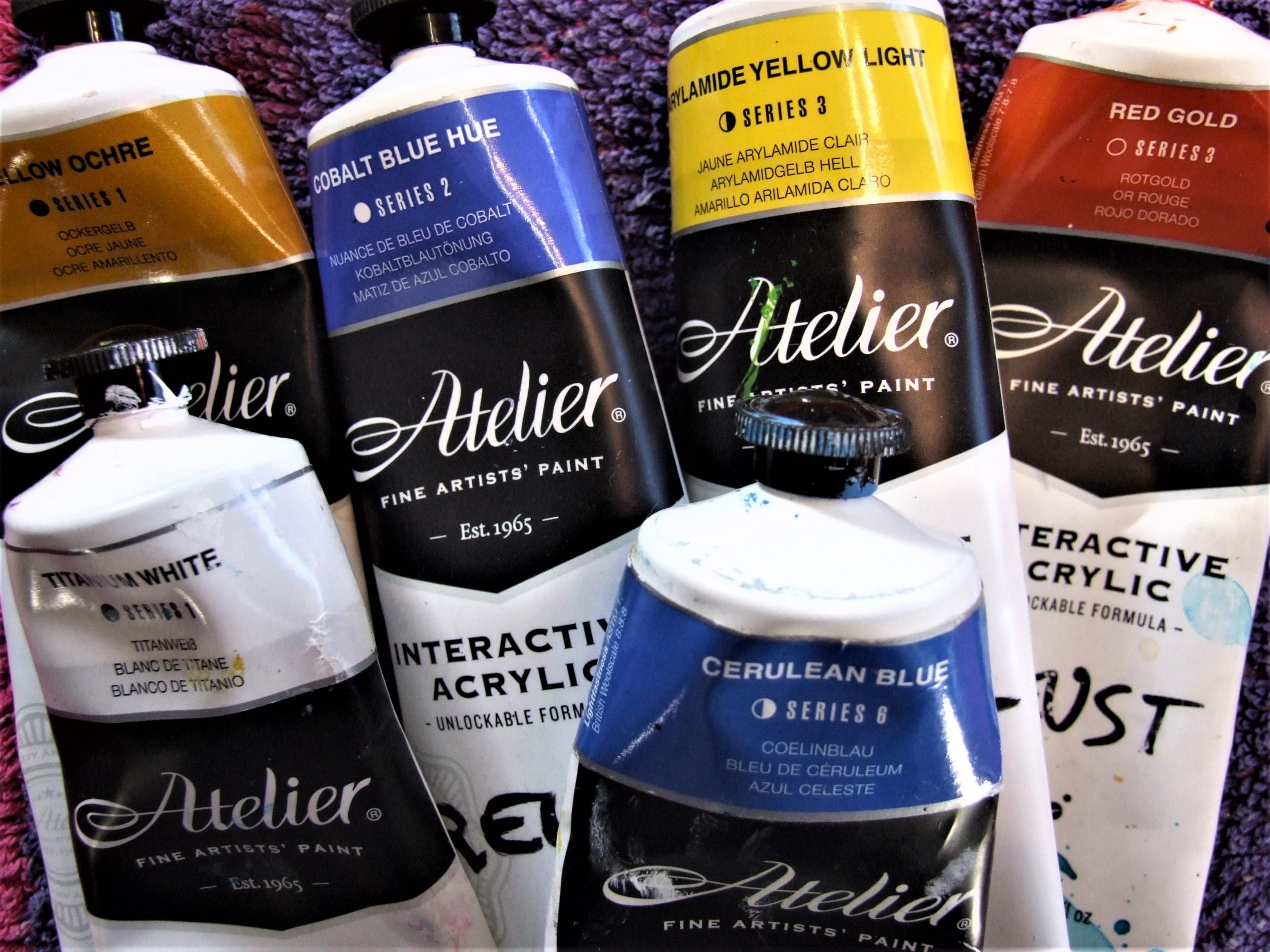
In the photo above, you can see that the labels include a “Series” number. Series 1 includes the less expensive pigments such as Titanium White, Burnt Umber, Yellow Ochre etc and the higher Series numbers include the cadmiums, cobalts and rarer pigments such as Cobalt Turquoise Light (Series 6). To counter this cost, paint manufacturers also create pigments as close as possible to the colour of the more expensive pigments, and include these in the artists quality range with “Hue” in the title. This way, artists can still use colours that are close to the colour of more expensive pigments. Cobalt Blue Hue, in the photo above for example, will be a series number (#2) less than the higher Series number Cobalt Blue, but with the assurance that this pigment is still of the highest artist quality.
This series numbering is the same across oil and watercolour pigments, whose manufacturers also create “Hue” pigments for the convenience of artists. While “Hues” are a good choice for those who are having to consider the economic side of their practice, there are some pigments that just can’t be replaced for me! When I need a good turquoise, I will always choose the Series 6.
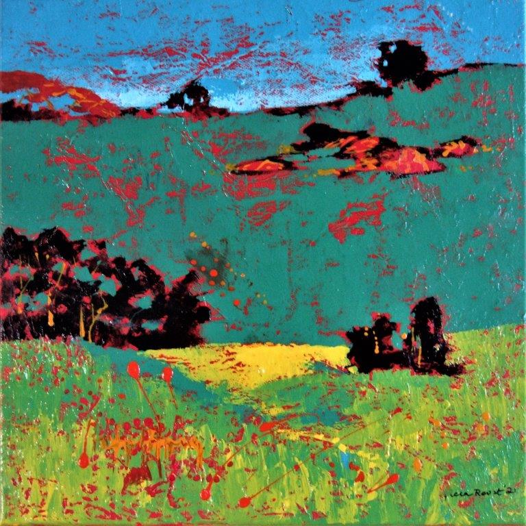
“Near Braidwood” a small painting (31 sq cms) that needs vibrant colour, would be less exciting if I had used the “hue” Cobalt Turquoise Light instead of the Series 6.
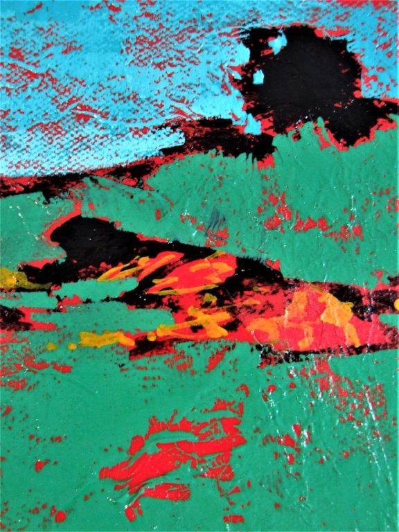
This detail photo shows the turquoise used in the sky and the green that was made by mixing the turquoise with yellow. These landscape studies on canvases that have been collaged with tissue paper and painted red for an underpainting are fun to cerate. See more on this technique in my book “Using Chroma Art Materials” available for purchase on the home page of my site www.triciareust.com.au