“Tree Search” Completed (demo from Crows Nest Workshop)

Sometimes I am happy to leave the texture and colour in a painting be enough to convey my message, but many times I add a motif, or symbol, of reality, to serve as a jumping board to bring in the viewer and provide an element of contact. This does not have to be a large part of the work, and often in fact, is quite small in relation to the painting.
“Tree Search” is one such work, that I have just completed after the workshop in Crows Nest. This work has several other paintings underneath so the texture is all over the canvas, which is a wonderful base for my intention to depict a landscape barren of trees.

1. This photo above shows the canvas after an application of gesso, and carious cardboard shapes taped on before the first glaze of colour is painted. I have left drawings and sections of the last painting that was on this canvas, showing, because I didn’t want to lose those areas.

2. Detail of the motif painted on, to connect the viewer with the landscape and message. This detail is around 9 cms wide and 13 cms high, so quite small in relation to the size of the canvas.

3. “Tree Search” Mixed Media on Canvas 61 cms wide by 91 cms high (24 inches wide by 36 inches high). This and other works are available as giclee reproductions, in any size on canvas or paper, through www.buyartnow.com.au
at Art House Reproductions. My works are all limited editions.

Completed the demo Lennox Mood

Another demonstration piece completed, using wet pastel as an underpainting, begun at the Brisbane Pastel Society of Australia meeting on August 6th 2024.

From different photos I had taken, I composed a rough sketch to set the tonal distribution of shapes.

The pink and yellow ochre AS soft pastels were applied to the white Colourfix. It is important to use a paper that can take being wet, and pastels that will mix readily with water.

The pastels were pushed into the paper with a Taklon brush and water.

I indicated the colours to be used, applying the soft pastels. The cloud area was to be blended, but the strokes left visible in the water. I intend this to be an almost monochromatic work, with the underpainting adding glistening elements of colour.

This was as far as I was able to go within the time limits of the meeting.

Lennox Mood. Pastel on half sheet AS Colourfix paper.

Completed Demo Wet Pastel Underpainting

Finally, now that I have returned from the road trip, I have some time to finalise some demonstration pieces. This is the wet pastel underpainting portrait demo from the PSA Brisbane meeting Tuesday August 6th.

Over a charcoal portrait study (begun at the NZ portrait workshop) on Art Spectrum Colourfix paper – Soft Umber – I placed green and raw umber AS soft pastels.

I then wet these areas with water and a taklon brush, and pushed the pastel into the paper, ensuring that all the pastel was melted.

Placing soft pastel over these areas to develop the portrait. This was as far as I was able to work, before the meeting was over.

The completed portrait demonstration. Pastel on a Quarter sheet Colourfix paper.

This drawing off to Germany – I’m off on my road trip!


This charcoal pastel study is off to Germany as a gift. I am off to deliver workshops on my road trip beginning in Canberra, then Newbridge, and Nelson Bay on my way home. These workshops include drawing, Mixed Media and also, pastel on canvas.
Looking forward to seeing former attendees and making new friends.

Instructional Video on Composition and Design Released

As well as several free videos on YouTube, I have now released my fourth video for sale through Pulsar Productions.
Link :https://www.pulsarproductions.com/artists/tricia-reust


This is a series of twelve sessions. it includes my pared down compositional techniques derived from geometric design.
I hope it proves useful !

Bay of Fires Evening

I completed the pastel on canvas “Bay of Fires Evening”, one of the works created from my recent trip to Tasmania.
The canvas is an old acrylic work, and was covered in Black Art Spectrum Pastel Primer and textured with combs while this layer was still wet.
Mostly I used hard pastels, laying them on the side and dry-brushing in order to have the lovely black lines of texture remain.

Ancient Notes

Finally completed this demonstration piece from a “Using Drawings on Canvas” workshop –
“Ancient Notes”. I love using my drawings on canvas and sharing how to do this archivally.

Revisiting “Open Up’ – pastel on repurposed paper. Progression 8 photos.

When I do a work for myself, as apart from a demonstration or teaching piece, I begin my defining my concept. This work began as a desire to comment on the many people in our world fleeing war and strife and seeking assistance from others. I wanted the ground to infer desert; I wanted a strong symbol of wealth – not only material but spiritual; and I needed to find a way of representing a multitude of streaming people. I decided on one of my blue and white jars with a lid, as a central motif of a container full of desirable offerings. The lid of course – fear often keeps the lid on our being generous in response to need.
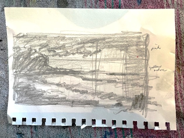
Now came the decisions about composition. I decided pastel would give the easiest method of contrast between texture in fabric and smoothness in the ceramic surface. Adding pumice to primer would make the paper very rough and give a tangible feeling of sand. A placement of the jar according to the golden mean would give me lots of opportunity to create directions in the fabric leading the eye to the jar, and an almost square format (because I already had a used empty frame ready for a new work!). The hardest motif was in searching for something to represent people. After many scribbles in my visual diary I settled on marks like curved dashes with dots at the head.
Only now could I begin on the creating of the work, with my concept defined and all my compositional decisions made.

1. I mixed dry pumice into wet Art Spectrum pastel primer (Soft Umber in colour) and applied over an old pastel work on rough watercolour paper. I distributed the pumice unevenly over the surface.

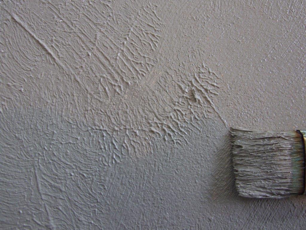
2. I used the same wide old bristle brush to add texture marks, patting it in some areas to leave raised marks, and adding directional marks.

3. Using soft pastel I placed the basic composition, ensuring the highlights on the fabric all led to the jar.

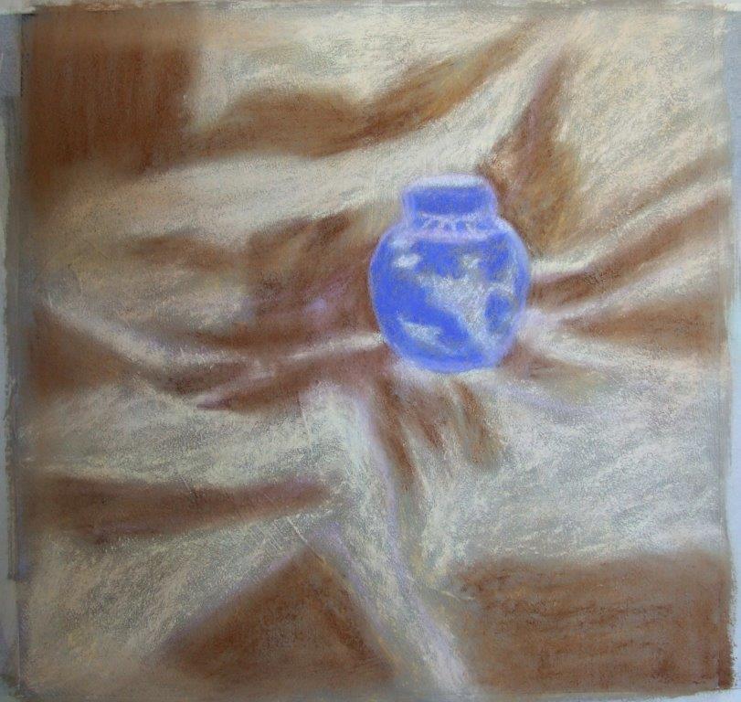
4. I then covered the surface with more soft pastel to establish a base and to begin to refine the drawing. I was really happy with the texture – even though representing fabric folds, I wanted a visual and tactile reference to sandy parched earth.

5. I used a flat bristle brush to push water into the layers of black, purple and ultramarine blue, so that there would be flat areas in the shadows. Wet pastel would flow better into the recesses of the texture marks.

6. When this dried, I continued to place soft pastel. The rough texture was a bit hard on the old fingers! I began to draw in the linear marks with dots – symbols of an untidy mass of humanity reaching towards a sealed receptacle of available nourishment.

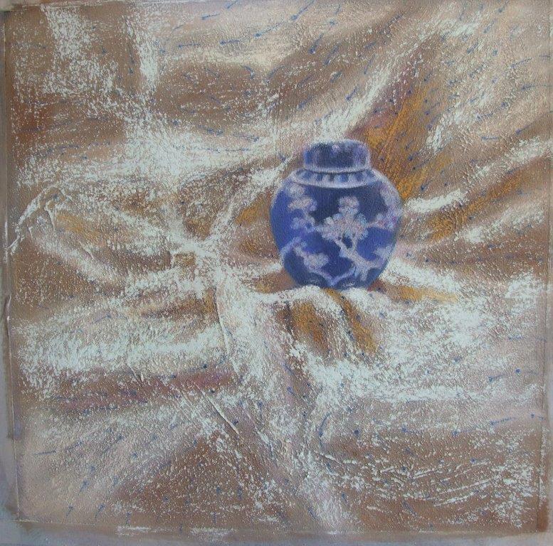
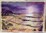
7. I darkened the dots on the marks closer to the jar. Using the new Art Spectrum soft square pastels, I placed a blue white over all the fabric area, deliberately creating cross flows in the fabric directions and catching the tips of the pumice texture marks. I placed touches of Red Gold around the fabric close to the jar.

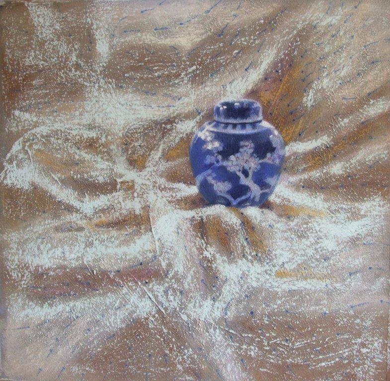
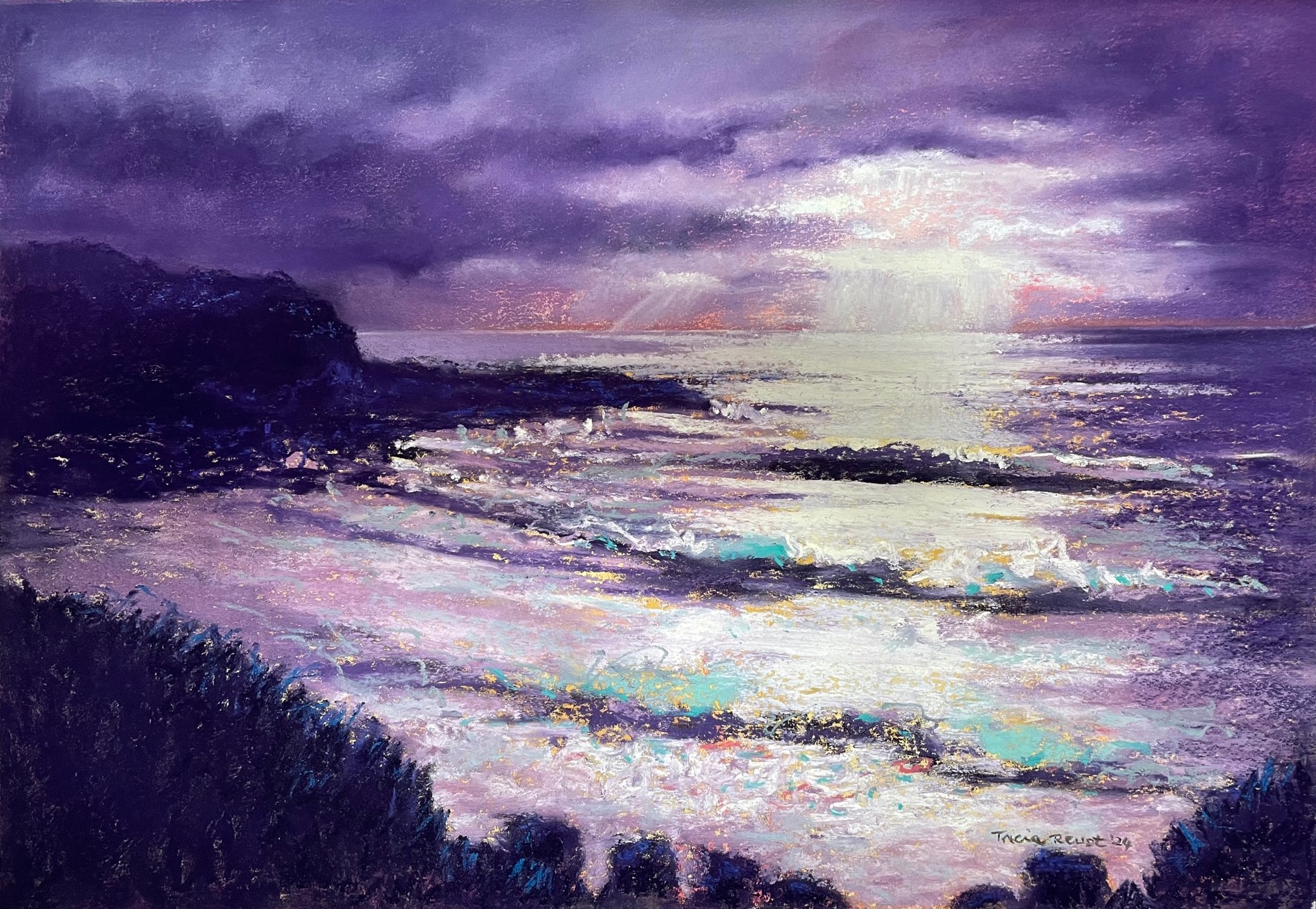
8. I worked more on the jar, using a new AS soft square orange white for the highlights, and using a blue white for heavier accents in the fabric. “Open Up!” 47.5 h by 46 w cms.